Work -
30.04.25
The New Khmer Aesthetic: Where Local Design Meets Global Confidence


A quiet revolution is happening in Cambodian visual culture — one that doesn’t shout, but signals clearly. You can see it in fashion, packaging, typography, digital content, and brand identity. It’s not just a look. It’s a mindset.
Welcome to the rise of the New Khmer Aesthetic — a design movement that blends pride in heritage with the sharpness of modern minimalism. It’s bold. It’s clean. It’s rooted. And it’s confidently Cambodian.
It’s not “traditional with a twist.”
It’s contemporary with a core.
The New Khmer Aesthetic isn’t a trend. It’s a language of expression being shaped by a new generation of Cambodian designers, brand builders, artists, and consumers.
What defines it:
It takes cues from architecture, Angkor motifs, silk weaving, religious iconography — but applies them with restraint, clarity, and sharp taste.
Young Cambodian creators, many self-taught or regionally trained, are redefining how tradition can be modernized — not erased. They’re no longer trying to “look global.” They’re looking at Khmer, globally.
Founders are pushing beyond Western templates and asking: “How do we design something that feels like us — but current?”
Young Cambodians now seek products that reflect their culture with confidence, not as a marketing trope. They want to support brands that are Cambodian by design, not just Cambodian by origin.
Local brands using Khmer design principles — fonts, textures, patterns — are perceived as more premium, not less.
It’s not a blank space. It’s space that lets meaning breathe.
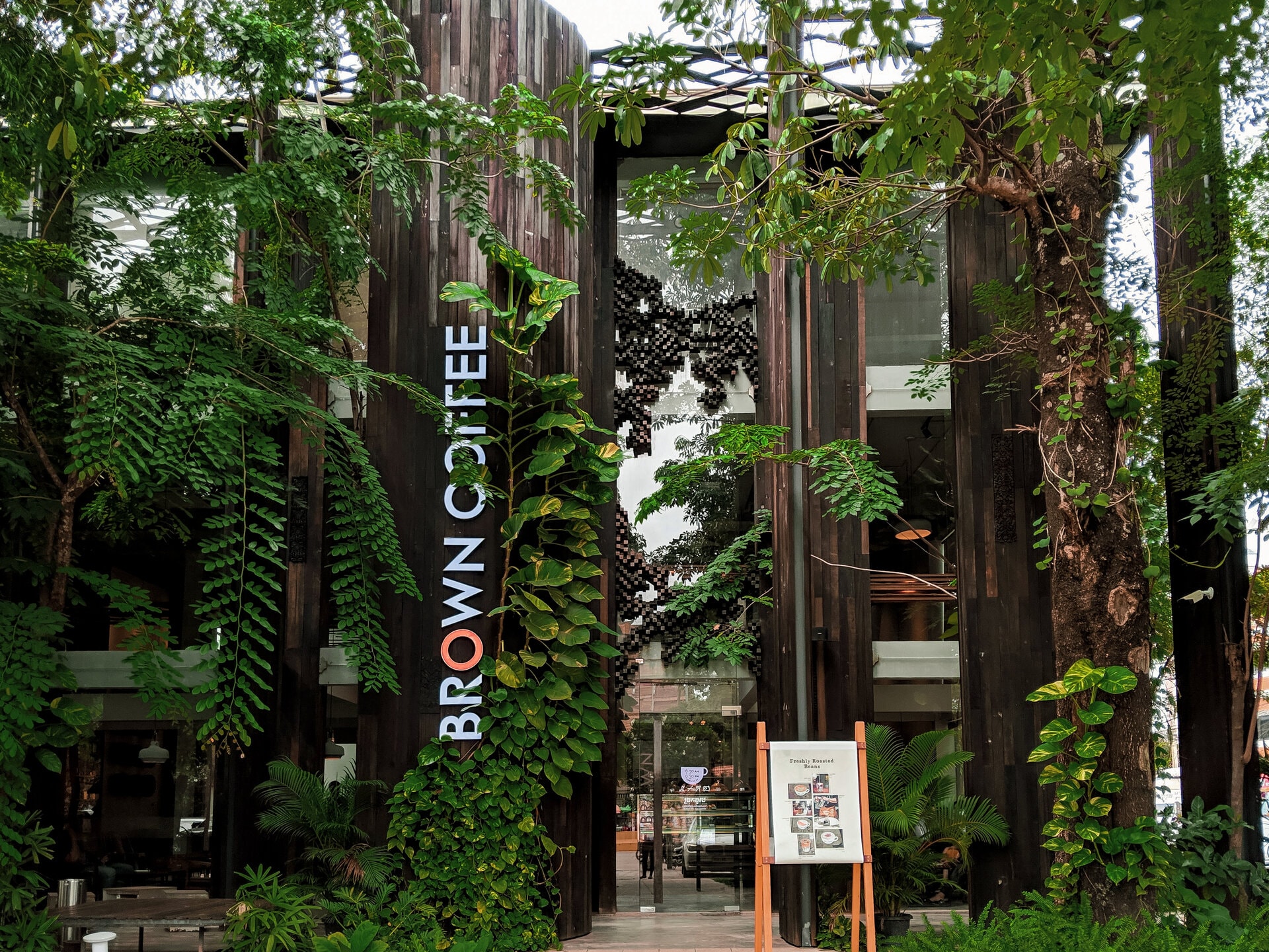
Whether in coffee, cosmetics, fashion, or F&B, attention to Khmer craft, language, or story is now seen as a trust marker, not just cultural nostalgia.
These aren’t visual tricks. They’re cues that say:
“This is made here. Thoughtfully. Confidently.”
The New Khmer Aesthetic isn’t just visual. It extends into voice:
Khmer design is evolving from ornamental to intentional.
And the best brand copy is evolving with it.
This aesthetic shift is more than a design choice.
It’s a cultural signal — that Cambodia doesn’t need to imitate to impress.
The brands that lean into this movement won’t just look better.
They’ll feel more real to the people they’re trying to serve — and more distinct in a market that’s still finding its visual voice.
Don’t just design for Cambodia.
Design from it.